
Indian currency notes have many small security and accessibility features that people notice every day but often do not think about. One such feature is the raised markings found on some notes, including the ₹100, ₹200 and ₹500 denominations.
These marks are not added just for decoration. They have an important purpose and can be especially useful for people with visual impairments.
You May Have Noticed These Raised Marks
Take a ₹100 note and gently run your fingers along its edges. You may feel raised lines on the note.
Similar tactile features are also present on ₹200 and ₹500 notes, though the pattern is different for each denomination.
For many people, these details may simply feel like part of the design. But they actually help make Indian currency easier to identify.
The Marks Are Different on Different Notes
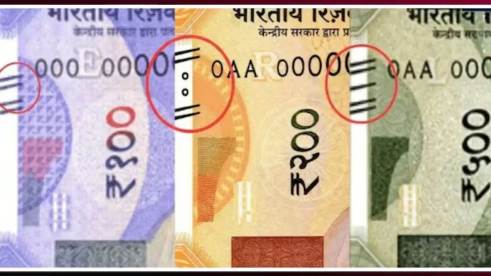
The tactile markings are arranged differently depending on the denomination.
On the ₹100 note, raised lines can be felt along the edges.
The ₹200 note has tactile lines along with circular marks.
The ₹500 note uses another arrangement of raised, slanting lines near its edges.
Because the patterns are different, they can help a person distinguish one denomination from another.
Why Are These Marks Added to Currency Notes?
The main reason is accessibility.
A person with a visual impairment may not be able to identify a currency note simply by looking at its colour, size or printed value. Raised features provide another way to recognise the denomination.
By touching the patterns with their fingers, people can get useful information about the note they are holding.
A Small Feature With an Important Purpose
Currency notes are handled by millions of people every day. We use them for buying groceries, paying bills, travelling and making other everyday payments.
Because of this, features that make currency easier to identify can be very useful.
The raised markings are a good example of how a small detail on a banknote can have a practical purpose beyond its appearance.
How Can You Check Them Yourself?
The next time you have a ₹100, ₹200 or ₹500 note, take a moment to look at its edges.
You can also gently run your fingers over the relevant areas to notice the raised patterns.
The exact arrangement differs between denominations, so comparing different notes can help you understand the difference.
Why Many People Never Notice Them
Most people identify currency by simply looking at the printed number and design. Because of this, tactile features can easily go unnoticed during normal transactions.
But for people who cannot depend on their eyesight, these raised patterns can make a meaningful difference when identifying currency.
Conclusion
The raised lines and tactile marks on ₹100, ₹200 and ₹500 notes are more than just design details. They are accessibility features that help people with visual impairments identify different denominations through touch.
So, the next time you receive one of these notes, take a closer look at its edges. You may discover a feature that you have been carrying in your wallet without ever noticing.
FAQ
What are the raised marks on Indian currency notes?
They are tactile features incorporated into certain Indian currency notes. They can be felt by touch and help with identifying denominations.
Which notes have these tactile markings?
The reported features include the ₹100, ₹200 and ₹500 notes, with different patterns used on each denomination.
What is the purpose of the raised marks?
They are mainly an accessibility feature, helping people with visual impairments distinguish between different currency denominations by touch.
Are the patterns the same on ₹100, ₹200 and ₹500 notes?
No. The markings are arranged differently on different denominations. The ₹200 note, for example, has tactile lines and circular marks, while the ₹500 note has a different arrangement of raised slanting lines.
Can I feel these markings on my own currency note?
Yes. You can gently run your fingers along the relevant edges of the note to notice the raised tactile features.